What is an Option?
An option is a special contract that connects two people: a buyer and a seller. It gives the buyer a choice (a right), not a compulsion, to buy or to sell something (like Nifty or a stock) at a fixed price within a limited time. The fixed price is the strike price, and the last date to use this choice is the expiry date.
What is Option Chain?
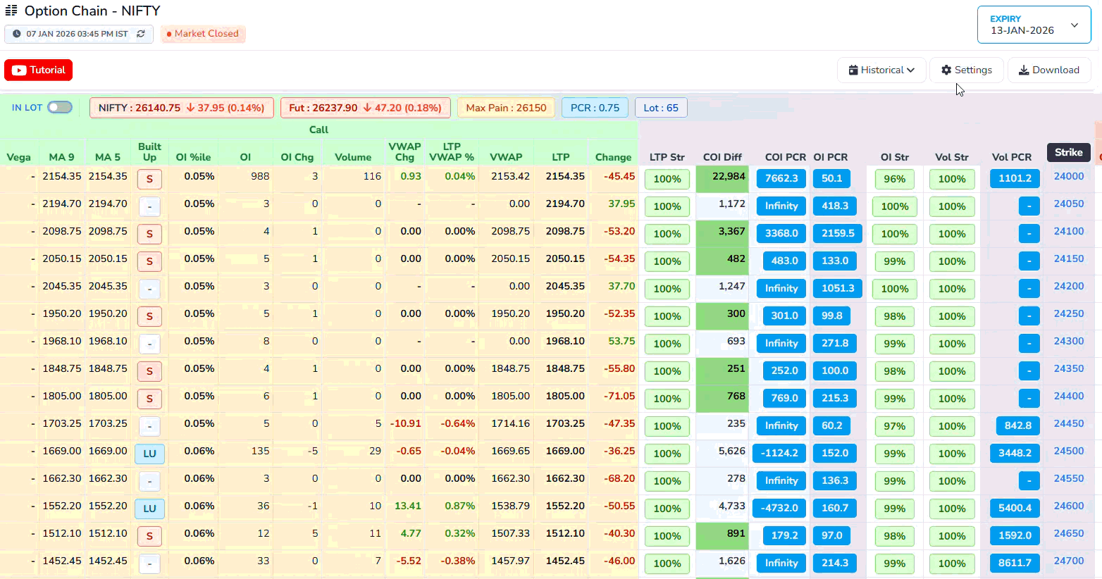
An option chain is simply a big list of all the options available for one stock or index, shown together in a table.
For one particular expiry date, it shows every strike price and, for each strike, the call options on one side and the put options on the other side. Next to each strike, the table shows useful numbers like the last traded price, how many contracts traded today, and how many contracts are still open. By looking at this one screen, a trader can quickly compare different strikes and see where most buying and selling interest is, instead of checking each option one by one.
Types of Options
Call Options and Put Options.
- Call Option: A call option gives the buyer the right to buy an asset at a specified price within a specific time period. Buyers of call options expect the price of the underlying asset to rise.
- Put Option: A put option gives the buyer the right to sell an asset at a specified price within a specific time period. Buyers of put options expect the price of the underlying asset to fall.
What Happens at Expiry
- On the expiry day, you check: "Is it useful to use my right or not?"
- If the market price makes your right beneficial, you use it.
- If the market price makes your right useless, you do nothing and let the option expire.
- In the worst case, your loss is only the premium you paid at the start.
Example: Call option
- Nifty is at 22,000
- You buy a call option with strike 22,000 and pay a premium of 100 points.
Case 1: Market goes up
- At expiry, Nifty becomes 22,300.
- Your contract allows you to "buy at 22,000" while the market is 22,300.
- The option is worth about 300 points (22,300 - 22,000).
- Your profit is roughly 300 - 100 = 200 points.
Case 2: Market goes down
- At expiry, Nifty becomes 21,700.
- Your right to buy at 22,000 is now useless.
- You simply don't use the option.
- Your loss is only the 100-point premium you paid.
Example: Put option
- Nifty is at 22,000.
- You buy a put option with strike 22,000 and pay a premium of 100 points.
Case 1: Market falls
- At expiry, Nifty falls to 21,500.
- Your contract allows you to "sell at 22,000".
- The option is worth about 500 points.
- After subtracting the premium, your profit is 500 - 100 = 400 points.
Case 2: Market rises
- At expiry, Nifty goes up to 22,500.
- Your right to sell at 22,000 is useless.
- You let the option expire.
- Your loss is only the 100-point premium.
Headers
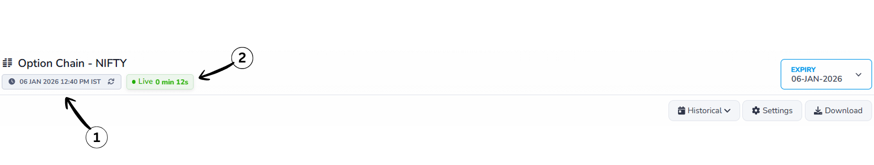
1Last Updated Time
This indicates the most recent time when the option chain data was refreshed. It helps users know how current the information is.
2Live Status
The Live Status indicator confirms that the option chain data is updating in real time. The timer shown next to it (for example, 0 min 12s) indicates how many seconds ago the data was last refreshed.
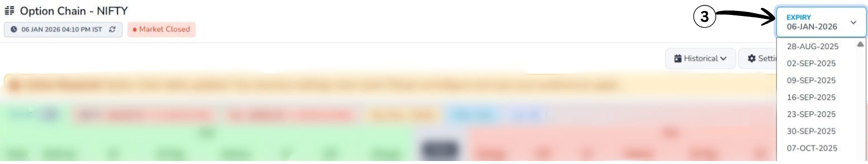
3Expiry Selection
This section allows users to select the expiry date for which they want to view the option chain data. Options typically have multiple expiry dates, and selecting one updates the displayed data accordingly.
4Explanation of Historical data

The Historical option allows you to view option chain data from a past time instead of live market data. When enabled, the table stops updating in real time and displays a previously recorded snapshot of prices, Open Interest, and volume.This helps users review earlier market conditions and analyze how the option chain behaved at a specific moment.
5Adjusting time in Historical data
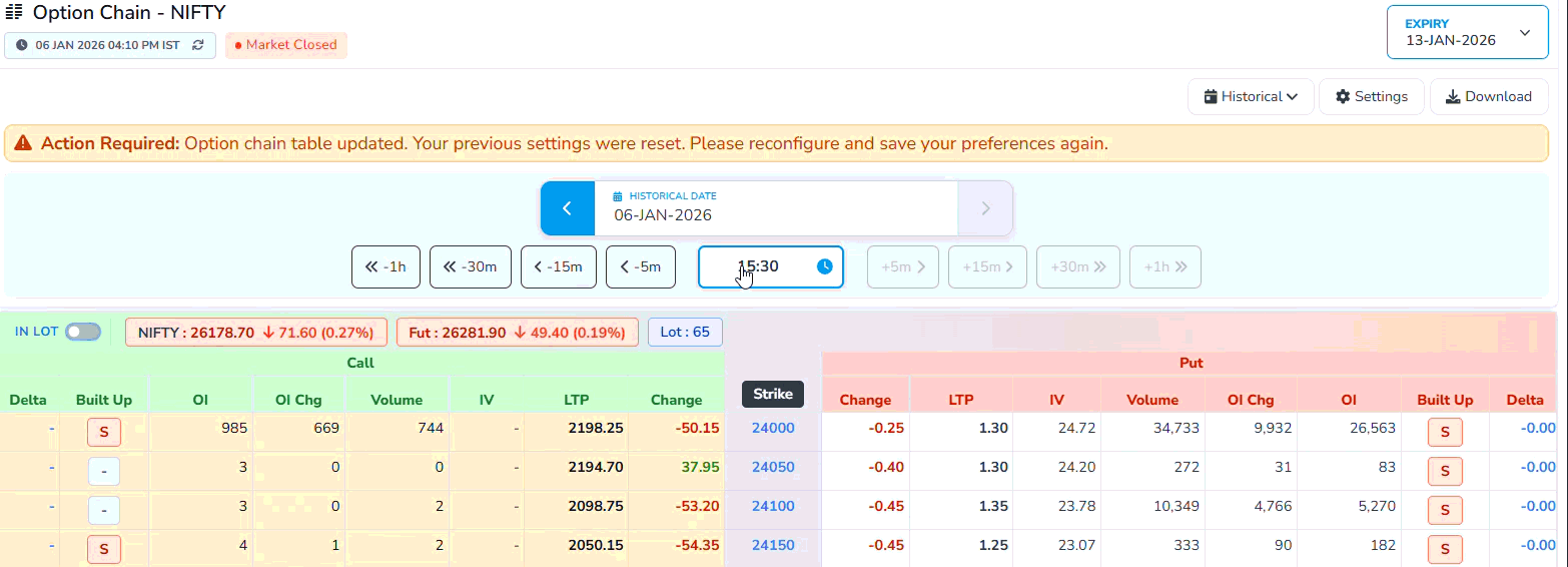
This feature allows you to navigate backward or forward in time to view option chain data at different
moments of the selected date.
Navigation buttons:
- Use –5m, –15m, –30m, –1h buttons to go back and review earlier snapshots of the market.
- Use +5m, +15m, +30m, +1h buttons to move forward toward more recent data, where available.
- The selected time is highlighted in the center, showing the exact moment for which the option chain data is displayed. This makes it easy to analyze how prices, Open Interest, and volume changed over time.
Settings
- Column Selection: Choose which data columns to display in the option chain table, such as Open Interest, Volume, Greeks, etc.
- Display Preferences: Adjust how data is presented, including sorting options and visual styles.
- Save Settings: Save your customized settings for future sessions to maintain a consistent view.
Explanation-Highlighted

We are introducing the Highlighting tool, which allows users to visually focus on specific columns in the Option Chain. By selecting a column such as Open Interest, Volume, or IV, users can instantly highlight it across all rows, making the data easier to scan and understand.
Using the Highlighting tool helps users quickly identify important patterns like where trading activity is highest, where positions are building, or which strike prices matter the most. Instead of manually scanning the entire table, users can guide their attention to only the data they want to analyze.
This feature is especially useful for simplifies complex option data into clear visual cues and helps users gain a basic understanding of how different columns influence market behavior.
Market Snapshot
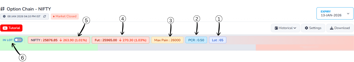
1What is LOT
In the options market, you cannot buy or sell NIFTY one-by-one. The exchange allows trading only in fixed bundles. That fixed bundle is called a LOT.
For NIFTY: 1 LOT = 65 NIFTY units means: This lot size (65) is fixed by the exchange, not by traders.
2Put Call Ratio
Put–Call Ratio (PCR) is a market‑sentiment indicator that compares how many put options are being traded (or are open) to how many call options are being traded (or are open) for the same index or stock. It tells you whether traders, as a group, are more focused on protection/downside (puts) or on upside (calls).
Formula of Put–Call Ratio (PCR)
Put–Call Ratio (PCR) = Total Put Open Interest ÷ Total Call Open Interest
Example:
- Total Put Open Interest = 24,00,000
- Total Call Open Interest = 20,00,000
Calculation:
PCR = 24,00,000 ÷ 20,00,000 = 1.20
What PCR Values Mean?
PCR (Put-Call Ratio)
PCR = Put OI / Call OI
More puts than calls, potential support
Balanced market sentiment
More calls than puts, potential resistance
3Max Pain
Max Pain is the price level at which the maximum number of option buyers (both CALL and PUT) lose money at expiry, because most options expire worthless, allowing option sellers to earn the highest profit.
Price breakdown
Above this price – most CALL buyers lose

Below this price – most PUT buyers lose

Near this price – both CALL and PUT buyers lose
This is why prices often move or settle near the Max Pain level close to expiry, especially in non-trending markets.
4Futures Price(FUT)
Futures Price is the price at which traders are currently willing to buy or sell NIFTY for a future date, and it reflects the expectation and direction of big traders in the market.
Price breakdown
Falling futures price – selling pressure and bearish expectation

Rising futures price – buying pressure and bullish expectation

Large price movement – strong conviction by big players
Since futures are mainly traded by institutions, the futures price often leads the spot market and signals direction early.
5NIFTY (Spot Price)
NIFTY Spot Price is the current real market value of the NIFTY index, calculated from the prices of its underlying stocks, and it represents the actual position of the market at that moment.
6IN LOT
IN LOT is a display setting that converts option data from raw numbers into lot-based values, making it easier to read, compare, and understand the actual trading size.
Data breakdown
OFF – values are shown as total quantity

ON – values are shown as number of lots

Same data, different display format
This setting helps traders quickly understand position size without dealing with large and confusing numbers.
In House Columns
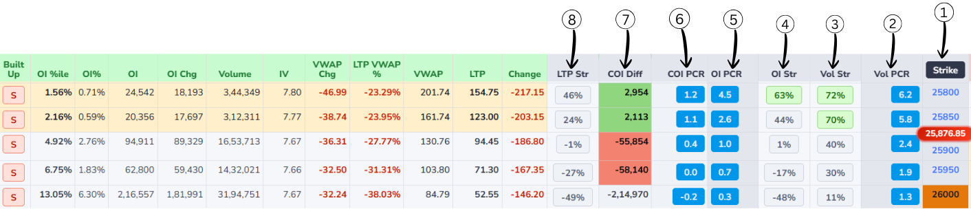
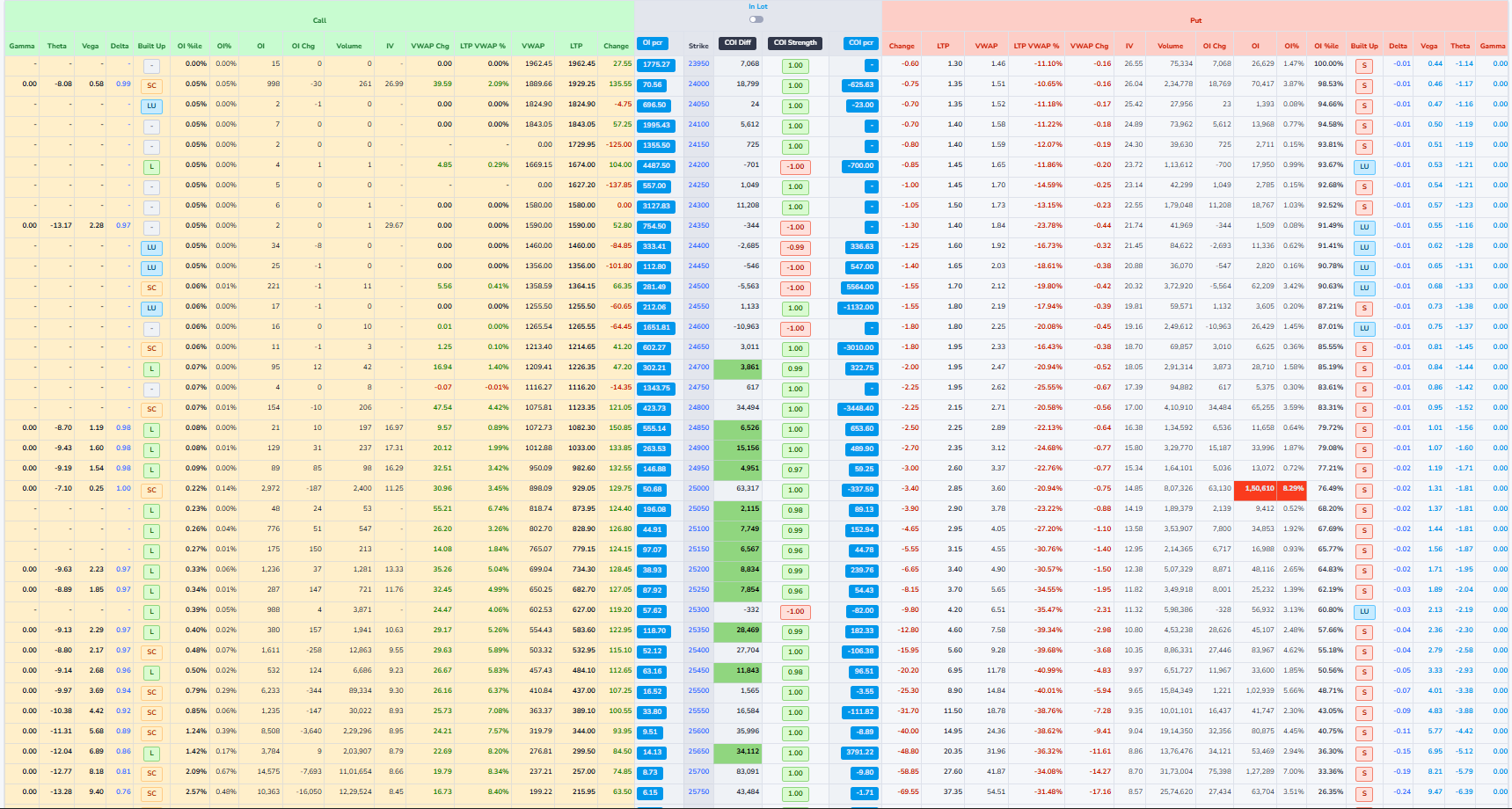
1Strike Price
Strike price is the fixed price written in the option contract at which you can buy or sell the underlying asset, depending on whether it is a call or a put option.
In an option chain, each row has one strike price like 21,800 or 22,000. This number is the agreed price for the deal: for a call option it is the price at which you have the right to buy, and for a put option it is the price at which you have the right to sell. The strike stays constant from the day the option is created until expiry, even though the market price keeps moving up and down. How far the market is from the strike helps decide whether the option is cheap or costly and whether it is in-the-money, at-the-money, or out-of-the-money.
2Vol PCR (Volume Put-Call Ratio)
Vol PCR shows where today's trading activity is happening more. It compares Put option trading with Call option trading.
In simple words, it tells us whether traders are trading more Puts or more Calls today.
Volume PCR (Vol PCR) — Formula
Vol PCR = Put Volume ÷ Call Volume
How to read the value:
Vol PCR < 1 → More Call trading
Vol PCR ≈ 1 → Equal Call & Put trading
Vol PCR > 1 → More Put trading
Very high Vol PCR → Extreme Put activity
Example:
Call Volume = 165
Put Volume = 238,571
Vol PCR = 238,571 ÷ 165 = 1445
In this example, Vol PCR is extremely high, meaning almost all trading activity is happening on the Put side.
3Vol Str (Volume Strength)
Vol Str shows which option side has stronger trading participation at a strike price.
It is based on trading volume, which means the number of trades happening right now.
- Based on option trading volume
- Shows trader participation
- Higher volume means stronger interest
- Helps confirm real market activity
- Useful for identifying strong strikes
Vol Str — Simple understanding
Higher Call volume → Call side strong
Higher Put volume → Put side strong
Very high volume → Strong conviction
Vol Str confirms whether the move is supported by real trading activity.
4OI Str (Open Interest Strength %)
OI Str shows which side is stronger at a strike price and how strong it is in percentage.
OI Str — Formula
OI Str = (Higher OI ÷ Total OI) × 100
How to read:
100% → Only one side is present
80–99% → One side is dominating
Around 50% → Both sides are equal
Simple idea:
The side with higher Open Interest is the stronger side.
Example:
Call OI = 2,000
Put OI = 8,000
Total OI = 10,000
OI Str = (8,000 ÷ 10,000) × 100 = 80%
80% means the Put side is much stronger and acting as support.
5OI PCR (Open Interest Put–Call Ratio)
OI PCR compares total put open interest to total call open interest for an index or stock.
OI PCR — Formula
OI PCR = (Total Put OI) ÷ (Total Call OI)
Example:
- Total Put OI = 150,000 contracts
- Total Call OI = 100,000 contracts
-
Apply formula:
OI PCR = Total Put OI ÷ Total Call OI - OI PCR = 150,000 ÷ 100,000 = 1.5
- Interpretation: OI PCR is above 1 → more put OI than call OI → traders are expecting a downside.
6COI PCR(Change in Open Interest Put–Call Ratio)
It shows which side added more fresh positions today —the put seller or the call seller.
COI PCR — Formula
COI PCR = Change in Put OI ÷ Change in Call OI
-
If COI PCR is above 1:
• More put OI was added than call OI.
• Put seller are stronger → the market has a bullish bias. -
If COI PCR is below 1:
• More call OI was added than put OI.
• Call seller are stronger → the market has a bearish bias.
Example 1
- Put OI added today: 30,000
- Call OI added today: 10,000
- COI PCR =30,000 ÷ 10,000 = 3
- This means put sellers are much more active, so the market has a bullish
Example 2
- Put OI added today: 15,000
- Call OI added today: 30,000
- COI PCR = 15,000 ÷ 30,000 = 0.5
- This means call sellers are more active, so the market has a bearish
Difference Between COI PCR v/s OI PCR
- OI PCR uses total Open Interest.
- OI PCR shows overall market sentiment.
- OI PCR changes slowly.
- OI PCR is better for broader trend bias.
- COI PCR uses change in Open Interest.
- COI PCR shows today's fresh sentiment.
- COI PCR changes quickly.
- COI PCR is better for intraday strength/pressure.
7COI Diff (Change in Open Interest Difference)
It shows who is stronger right now at that strike put side or call side.
- Positive number → Put sellers are stronger (Bullish)
- Negative number → Call sellers are stronger (Bearish)
COI Diff — Formula
COI Diff = Put OI − Call OI
Easy Example
Call OI = 10,000
Put OI = 13,000
COI Diff = 13,000 − 10,000 = +3,000
Positive value → Buyers / support side is strong (Bullish signal)
8LTP Str (Last Traded Price Strength)
LTP Str shows which option side is stronger at a strike price based on price movement.
It focuses only on how the Call and Put prices are moving, not on volume or open interest.
- Based on Last Traded Price (LTP)
- Shows price strength, not quantity
- No fixed formula is used
- Behavior-based indicator
- Rising price means increasing strength
- Falling price means decreasing strength
LTP Str — Simple understanding
Call price up & Put price down → Call side strong
Put price up & Call price down → Put side strong
Both moving same direction → No clear strength
LTP Str helps identify real-time price pressure in the market.
Core Columns
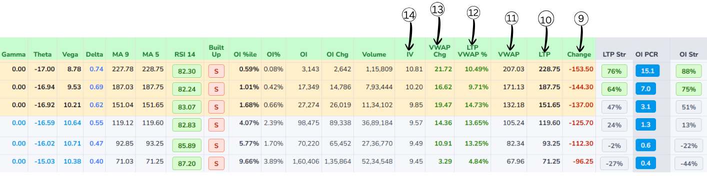
9Change
LTP Change shows how much the latest price has moved compared to an earlier reference price.
LTP Change — Formula
LTP Change = Today's Current LTP − Yesterday's Closing Price
- If LTP Change is positive, the option is trading higher than before (price has gone up).
- If LTP Change is negative, the option is trading lower than before (price has gone down).
10Last Traded Price(LTP)
It is the price of the most recent trade that happened in that option or stock on the exchange. Whenever a new trade is executed, that deal's price becomes the new LTP, so it always shows the latest price at which buyers and sellers actually agreed.
11VWAP (Volume Weighted Average Price)
VWAP tells you the average price at which most of the trading happened during the whole day.
VWAP — Interpretation
- Price above VWAP → buyers strong → indicates bullishness.
- Price below VWAP → sellers strong → indicates bearishness.
12LTP VWAP %
LTP VWAP % shows how far the current Last Traded Price is from today’s VWAP in percentage terms.
LTP VWAP % — Formula
LTP VWAP % = (LTP − VWAP) / VWAP × 100
- If LTP is above VWAP, this percentage will be positive; it tells you how many percent the latest price is above the average traded price.
- If LTP is below VWAP, the percentage will be negative; it shows how much cheaper the latest trade is compared to the day’s average.
- A small number (like +0.5%) means LTP is close to VWAP; a big number (like +5% or −5%) means price has moved far away from the average, which some traders see as overbought / oversold intraday.
Example:
- LTP (Last Traded Price) = 105
- VWAP = 100
-
Apply formula:
LTP VWAP % = (LTP − VWAP) / VWAP × 100 - LTP VWAP % = (105 − 100) / 100 × 100 = 5%
- This means: LTP is 5% above the VWAP (buyers stronger).
13VWAP Change
VWAP Change tells you how much today’s VWAP has moved compared to a previous reference VWAP, usually yesterday’s VWAP for the same option.
VWAP Change — Formula
VWAP Change = Today’s VWAP − Yesterday’s VWAP
- If VWAP Change is positive → today’s average traded price is higher than yesterday’s average (buyers were willing to pay more).
- If VWAP Change is negative → today’s average traded price is lower than yesterday’s average (sellers accepted lower prices).
- VWAP Change with volume helps show whether the market’s “fair” traded level is shifting up or down with strength.
14Implied Volatility(IV)
Implied Volatility (IV) tells you how much the market expects the price of the stock or index to move in the future.
Implied Volatility (IV) — Key Points
- IV does not tell you whether the price will go up or down, only how big the move might be.
- IV is shown as a percentage per year (for example, 15%, 20%, 30%).
- A higher IV means the market expects bigger swings and more uncertainty.
- A lower IV means the market expects smaller moves and more stable prices.
- When IV is high, options usually become more expensive because the chance of a big move is higher.
- When IV is low, options become cheaper because big moves are less expected.
Derived Metrics
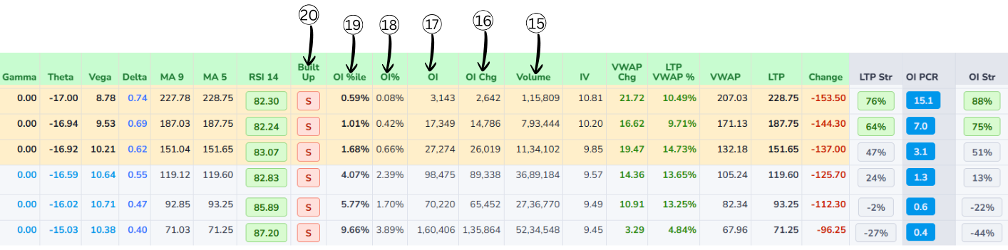
15Volume
Volume is the total number of contracts traded today for that specific option (that strike and expiry).
- Every time one buyer and one seller complete a trade, volume increases by 1 contract.
- Volume counts all trades, whether they are opening new positions or closing old ones.
- High volume means that option is actively traded and it is easier to enter and exit.
- Very low volume means fewer traders are interested there, so the bid-ask spread can be wide.
- Volume resets to zero every new trading day and builds up through the day.
16Change in OI(Open interest)
Change in OI (Change in Open Interest) shows how much the number of open contracts has gone up or down compared to the previous day.
Change in OI — Formula
Change in OI = Today's OI − Yesterday's OI
- Open Interest is the total number of contracts that are still open and not closed.
- If Change in OI is positive → new positions were added (more contracts are now open).
- If Change in OI is negative → traders closed positions (fewer contracts left open).
- A big positive Change in OI with good volume means fresh money is entering that strike.
- A big negative Change in OI means traders are exiting that strike and interest is decreasing.
17OI(Open interest)
Open interest (OI) tells you how many option contracts are currently "alive" for a particular strike and expiry.
In simple words, it is the count of all contracts that have been created but not yet closed, squared off, or expired. If new traders open fresh positions, open interest goes up; when traders close their existing positions, open interest goes down.
A high OI at a strike usually means many traders are interested and the option is more liquid, so it is easier to buy and sell there.
18OI Percent
OI Percent shows how much OI increased or decreased today in percentage.
OI Percent — Examples
- If OI increased from 1,00,000 to 1,10,000 → OI Percent = +10%
- If OI fell from 1,00,000 to 90,000 → OI Percent = –10%
19OI Percentile
OI Percentile tells you how high or low today’s OI is compared to its past levels.
OI Percentile — Examples
- If OI Percentile is 90% → Today’s OI is higher than 90% of previous days → very high → strong interest.
- If OI Percentile is 10% → Today’s OI is higher than only 10% of previous days → very low → weak interest.
20Built-up
Built-up in an option chain tells you what kind of positions are getting created or closed at a strike by looking at price + OI together. It is usually shown as four types:
-
Long Buildup
- Price goes up and Open Interest goes up.
- New buyers are entering and holding positions.
- Generally indicates bullish interest at that strike.
-
Short Buildup
- Price goes down and Open Interest goes up.
- New sellers (shorts) are entering and holding positions.
- Usually indicates bearish sentiment.
-
Short Covering
- Price goes up and Open Interest goes down.
- Traders who were short are closing their positions.
- Often seen when a down-move is ending or reversing.
-
Long Unwinding
- Price goes down and Open Interest goes down.
- Traders who were long are exiting or booking profits.
- Shows bullish positions reducing, not fresh shorts being added.
Technical Indicators Explanation
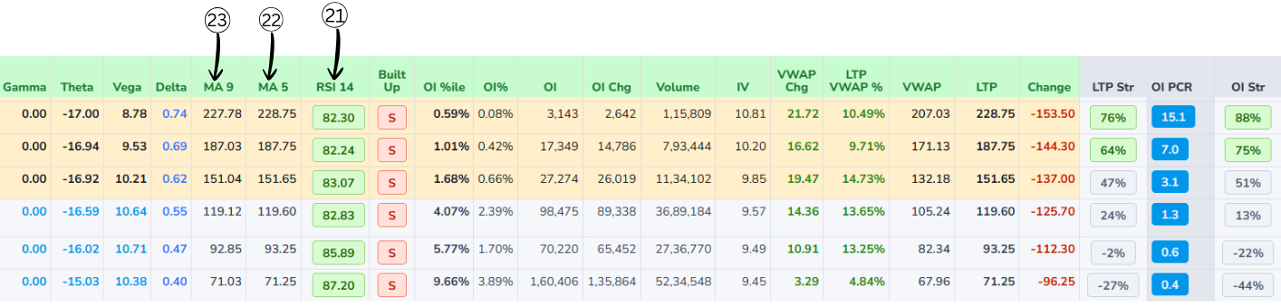
21RSI 14 (Relative Strength Index)
RSI 14 is a momentum indicator that measures the strength of price movement over the last 14 periods. It helps identify whether buying pressure or selling pressure is dominant. The RSI value always ranges between 0 and 100 and is displayed using clear color-coded conditions for easy understanding.
RSI Color Coding
RSI above 60
RSI between 40 and 60
RSI below 40
RSI Formula & Example
- RS = Average Gain ÷ Average Loss
- RS = 18 ÷ 7 = 2.57
- RSI = 100 − (100 ÷ (1 + RS))
- RSI = 100 − (100 ÷ 3.57)
- RSI ≈ 72
- RSI ≈ 72 → > 60Bullish
The system also highlights the top three and bottom three RSI values across strikes, making it easy to quickly spot the strongest bullish and bearish momentum. Background coloring follows the same logic used for OI PCR, helping users visually compare momentum strength.
22MA 5 (5-Period Moving Average)
MA 5 represents the average price of the last five periods and is mainly used to track very short-term price movement. Because it reacts quickly to price changes, it helps traders understand immediate market momentum. When the price stays above MA 5, it usually indicates short-term buying strength, while price below MA 5 suggests short-term weakness. Traders often use MA 5 for quick entries and compare it with MA 9 to confirm the trend.
MA 5 — Formula & Example
- Example: Last five prices are 226, 227, 228, 229, 230
- MA 5 = (226 + 227 + 228 + 229 + 230) ÷ 5
- MA 5 = 228
23MA 9 (9-Period Moving Average)
MA 9 represents the average price of the last nine periods and provides a smoother view of the short-term trend compared to MA 5. It helps reduce small price fluctuations and is often used as a confirmation indicator. When MA 5 remains above MA 9, it usually signals bullish momentum, and when MA 5 stays below MA 9, it signals bearish momentum.
MA 9 — Formula & Example
- Example: Last nine prices are 220, 222, 225, 224, 226, 227, 228, 229, 230
- MA 9 = (220 + 222 + 225 + 224 + 226 + 227 + 228 + 229 + 230) ÷ 9
- MA 9 ≈ 227.8
Greeks
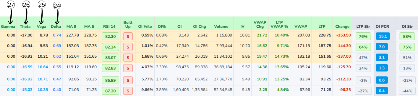
Vega Volatility
- Shows how much the option price will change if implied volatility changes by 1 percentage point.
- Higher volatility makes options more expensive; lower volatility makes them cheaper.
- Example: Vega = 2.5 means if IV goes from 20% to 21%, the option price is expected to increase by about 2.5 points.
- Options with more time to expiry and near-the-money strikes usually have higher vega.
Gamma Delta Change
- Tells how much delta itself will change when the underlying moves by 1 point.
- If delta is "speed" of the option, gamma is the "acceleration" – how quickly that speed changes.
- Example: A call has delta 0.40 and gamma 0.05. If Nifty goes up 1 point, new delta ≈ 0.45 (0.40 + 0.05). If it goes up another 1 point, delta may rise again to about 0.50.
- Gamma is usually highest for options near the current market price and close to expiry.
Theta Time Decay
- Shows how much an option's value is expected to decrease each day just because time is passing.
- For option buyers, theta is usually negative → the option loses value daily.
- Example: Theta = −3 → if all else stays the same, the option loses about 3 points in value per day.
- Time decay accelerates as the expiry date approaches, especially for options near the money.
Delta Price Change
- Tells how much the option price is expected to move if the underlying moves by 1 point.
- Call options have positive delta (they gain when price goes up); put options have negative delta (they gain when price goes down).
- Example: If a call has delta 0.40 and Nifty moves up 1 point, the option price is expected to go up about 0.40 points.
- A delta close to 0 means the option hardly reacts to small price moves; a delta close to 1 (or −1 for puts) means it moves almost point‑for‑point with the underlying.
Relationships Between Greeks
- Delta & Gamma: Delta is "first reaction" of the option price when the underlying moves; Gamma is how fast that reaction itself changes. High Gamma = Delta can jump quickly; Low Gamma = Delta changes slowly.
- Gamma & Theta: High Gamma (very responsive to price moves) usually means high Theta (faster value loss with time). This is the trade‑off: strong benefit from small price moves (high Gamma) comes with faster time decay (more negative Theta).
- Vega with Delta & Gamma: Vega measures sensitivity to implied volatility; when IV changes, it also affects Delta and Gamma. Higher IV: Deltas move closer to 0.5, Gamma increases. Lower IV: Deltas of ITM options move closer to 1 (or −1 for puts), Gamma drops.
- Time to Expiry: More time left: Deltas are softer (closer to 0.5), Gamma is smaller, Theta is slower, Vega is larger. As expiry nears: Deltas move quickly toward 1 or 0, Gamma spikes near the money, Theta decay speeds up, Vega shrinks.
Total/Selected
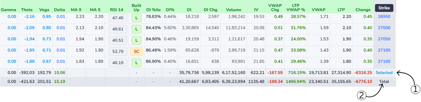
Selected Row Custom Focus
- Displays the combined data of only those strike prices that the user has manually selected in the option chain.
- Allows users to focus on specific strikes and analyze their cumulative Open Interest, OI Change, Volume, IV, VWAP, LTP, and price Change without considering the entire market.
- Especially useful when analyzing particular levels or strategies, as it provides a clear and filtered view of how the chosen strikes are behaving collectively.
Total Row Market Summary
- Represents the aggregated data of all available strike prices shown in the option chain.
- Provides a complete market-wide summary by combining values such as total Open Interest, total Volume, overall price Change, and other key metrics.
- Helps users understand overall market participation and sentiment by showing how all strikes are contributing to the option chain as a whole.
How to Use Selected vs Total
- By comparing the Selected and Total rows, users can quickly determine how much influence the selected strikes have relative to the entire market.
- This comparison makes it easier to identify whether trading activity is concentrated in specific strikes or spread broadly across the option chain.